Looking for how to make the best graphs in Stata? Data visualizations and predictive margins plots? How to use coefplot in Stata? Let’s do this.

This page has a short link: erka.me/coef2 will bring you back here.
Table of Contents (click to expand)
- Introduction (recommended books, downloadable files to follow along with this tutorial)
- initial-erika-setup.do You need to run this to use this tutorial.
- demo-india.do Run this and you will make the best graphs in Stata in one shot; then you can edit as you follow along in the tutorial.
- Figure 1 – horizontal boxplot (hbox in Stata)
- Figure 2 – twoway scatter plot with linear fit line (lfit in Stata)
- Figure 3 – twoway scatter with lfit using mutiple axes (alt in Stata)
- Regression and coefplot introduction
- Figure 4 – single coefplot for model coefficients
- Figure 5 – single coefplot with a cool feature of conditionally displaying significance stars*
- Figure 6 – coefplot graphing multiple models in one plot
- Marginal effects introduction
- Figure 7 – Average Marginal Effects (AMEs) using marginsplot, noci with markers
- Figure 8 – AMES using marginsplot and semitransparent shaded regions for CIs (recastci(rarea) in Stata)
- Figure 9 – Ideal type predictive margins; marginal effects at representative values (MERs) visualizations
- Comment Section (must register to post – free to register. Comments are moderated.)
To cite this resource in APA 7
Sanborne, E. (2021, June). How to make the best graphs in Stata. https://geterika.com/2021/06/15/how-to-make-the-best-graphs-in-stata-marginsplots-and-quality-data-visuals/
This is not intended to be an exhaustive tutorial, but, rather, a sampling of how to make a some of the best graphs in Stata for your regression models and predictive margins plots in particular, and some smooth descriptive graphs as well. In this tutorial, we will use horizontal boxplot (hbox) and marginsplot which are built-in Stata commands. We will also use the user-written coefplot (by Ben Jann) which is amazing. This tutorial should help get you started on your data visualizations! Note that I am creating this tutorial with Stata/SE 16.1.
You should get these two books: Long and Freese (2014) “Regression Models for Categorical Dependent Variables Using Stata” as a go-to reference manual for Stata and nonlinear regression, with an emphasis on interpretation. The book is a companion to the Spost13 Stata commands, but the text will help you know what you’re doing in general with regression analyses. I also recommend Michael Mitchel’s (2012) “A Visual Guide to Stata Graphics,” and of course The Stata Forum.
ATTN! Everyone needs to run initial-erika-setup.do file first.
And If you run both do-files, you will have this entire tutorial in front of you on your own system to work with and learn. That’s my recommended approach to this tutorial. Run initial-erika-setup.do. Then run demo-india.do. Enjoy!
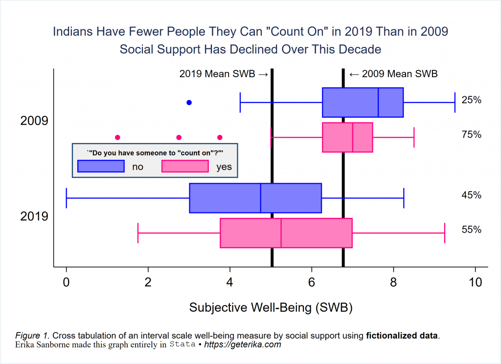
Okay! Let’s get started with a horizontal boxplot, which is hbox in Stata. As noted above, You can also download the do-file for the entire tutorial and run it all at once, so you have everything “live” on your own system if you want. It is called demo-india.do right above here. Alternatively, you can just follow along and copy-paste, but you will still need to run the initial-erika-setup.do file to install the user-written programs I use in this and other tutorials. Let’s make the following boxplot to start off.
//This first example uses only stock Stata. If you copy-paste this code block into
//your do-file editor, you can run it on your system as-is.

*load the demo data file
use https://geterika.com/downloads/demo1, clear


/*If using an older version of Stata, you might encounter a Java runtime error [r(5100)]. If you do, just <right-click> + <save-as> that data file. Download it to your system and run from there as a workaround.
*/


*horizontal boxplot over social support over decade - yeah, over over...
graph hbox swb, over(counton, relabel(1 "no" 2 "yes")) ///
over(decade, sort(sortreg)) ///
title(`"Indians Have Fewer People They Can "Count On" in 2019 Than in 2009"' ///
"Social Support Has Declined Over This Decade", span size(*.7) linegap(1.5) margin(medium)) ///
caption("{it:Figure 1.} Cross tabulation of an interval scale well-being measure by social support using {bf:fictionalized data}." ///
"{stSerif:Erika Sanborne made this graph entirely in} {stMono:Stata} {&bullet} {it:https://geterika.com}", size(*0.7) span) ///
asyvars bar(1, fcolor(blue) blcolor(blue) bfcolor(blue)) ///
marker(1, mcolor(blue) msymbol(o)) ///
bar(2, fcolor(pink) blcolor(pink) bfcolor(pink)) bargap(15) ///
yline( 6.77, lcolor(black) lwidth(thick)) ///
yline( 5.03, lcolor(black) lwidth(thick)) ///
ytitle("Subjective Well-Being (SWB)", linegap(1.5) margin(medium)) ///
text(2.65 100 "2019 Mean SWB {&rarr}", placement(ne) tstyle(smbody)) ///
text(6.8 100 "{&larr} 2009 Mean SWB", placement(ne) tstyle(smbody)) ///
text(9.6 85 "25%", placement(ne) tstyle(smbody)) ///
text(9.6 65 "75%", placement(ne) tstyle(smbody)) ///
text(9.6 30 "45%", placement(ne) tstyle(smbody)) ///
text(9.6 10 "55%", placement(ne) tstyle(smbody)) ///
marker(2, mcolor(pink) msymbol(o)) ///
ylabel( ,nogrid) ///
graphregion(fcolor(white)) ///
legend(rows(1) position(9) ring(0) size(*.8) ///
region(fcolor(gs15) lstyle(solid) lcolor(navy) margin(small)) ///
subtitle({bf:`"Do you have someone to "count on"?"'}, size(*.5) ) ///
bmargin(5 0 4 0)) ///
name(figure1, replace)
graph export figure1.svg, replace
Run this on your own and check it out. Change settings and see what differs. There is a lot going on in this descriptives plot, right? We’ve got a horizontal box plot (hbox) for a continuous measure, “over” a binary indicator variable of social support (counton) “over” another binary indicator variable of whether it is 2009 or 2019 (decade). Cool, right? This is really useful technique. You should be able to play with the code, read the documentation as needed, and be able to use this to make the best graphs in Stata for your own projects. You can do this! 🙂
For fun, I put in a few extra things that I know Stata beginners struggle with: We’ve got quotation marks in the title, multi-line title, various customized legend options, text inserted into the graph region, extra lines added into the graph region, various text customizations, margins around titles for better spacing, arrows pointing at things…
Note carefully the `”compound double quotes”‘ for including quotes in a title. I always put a size(* _ ) option into all of my labels and titles, so that I can adjust them to appear exactly as I want. Use span to make text fields span the full width. I find that margin(medium) sets titles and other text fields apart nicely. You include graphregion(fcolor(white)) to get rid of that horrible blue default that fills the graph region if you don’t turn it off through a scheme or other approach. And in this example, I used bmargin to nudge the legend into the exact opening the data provided, after placing it into clock position 9. That’s a bit of a trial-and-error game, but very useful after sizing the legend to fit.
I’ve tried to minimize abbreviations so you could know what I was writing. You will quickly learn that you do not have to type whole words in Stata for things to happen. View -help graph box- inside Stata for much more. By the way, I prefer grstyle (by Ben Jann) rather than manually setting many of these customizing options, but I wanted to give you something “stock” here, so here you have it.
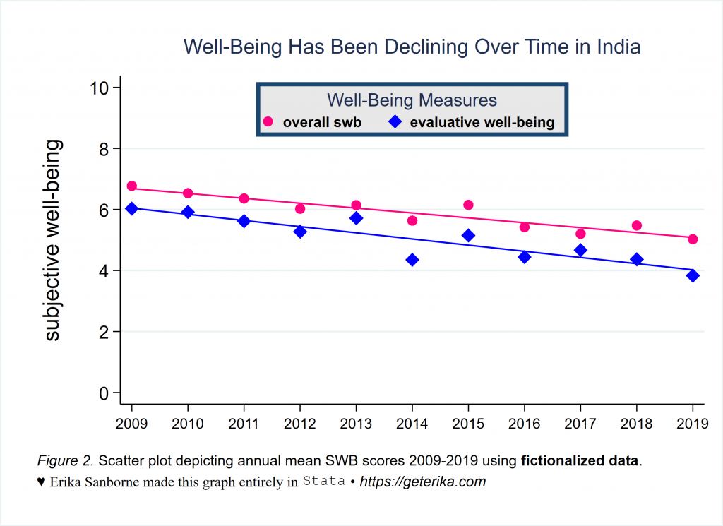
Now Let’s Do a twoway scatter Plot With linear fit lines
*load the demo data file
use https://geterika.com/downloads/demo1, clear

*Figure 2
*gotta generate some measures of central tendency first
//meanswb
//This generates the national average per year for swb
bysort year : egen meanswb=mean(swb)
label variable meanswb "annual mean overall swb"
label values meanswb meanswb
//meanladderAve
//This generates the national average per year for evaluative well-being
bysort year : egen meanladderAve=mean(ladderAve)
label variable meanladderAve "annual mean evaluative well-being"
label values meanladderAve meanladderAve
//meanincome
//This generates the national average household income per year
bysort year : egen meanincome=mean(income)
label variable meanincome "annual mean HH income"
label values meanincome meanincome


*multiple scatter plots of different variables can go on the same plot, with fit lines even
twoway (scatter meanswb year, ms(O) color(pink) msize(medium)) ///
       (lfit meanswb year, pstyle(p1) lstyle(solid) lcolor(pink))  ///
       (scatter meanladderAve year, ms(D) color(blue) msize(medium)) ///
       (lfit meanladderAve year, pstyle(p2) lstyle(solid) lcolor(blue)), ///
       legend(label(1 "{bf:overall swb}") ///
	   label(3 "{bf:evaluative well-being}") ///
       order(1 3) cols(2) pos(12) ring(0) size(small) ///
	   title("Well-Being Measures", size(*.7)) ///
	   region(fcolor(dimgray) ///
	   lcolor(navy) lwidth(thick) margin(small))) ///
ylabel(0(2)10, angle(horizontal)) xlabel(2009(1)2019, labsize(small)) ///
graphregion(fcolor(white)) ///
xtitle("") ytitle("subjective well-being", size(*1.2) margin(medium)) ///
title("Well-Being Has Been Declining Over Time in India", linegap(1.0) margin(medium) size(*.8)) ///
caption("{it:Figure 2.} Scatter plot depicting annual mean SWB scores 2009-2019 using {bf:fictionalized data}." ///
"{&hearts} {stSerif:Erika Sanborne made this graph entirely in} {stMono:Stata} {&bullet} {it:https://geterika.com}", size(*0.8) span linegap(1.2) margin(medium)) ///
name(figure2, replace)
graph export figure2.svg, replace
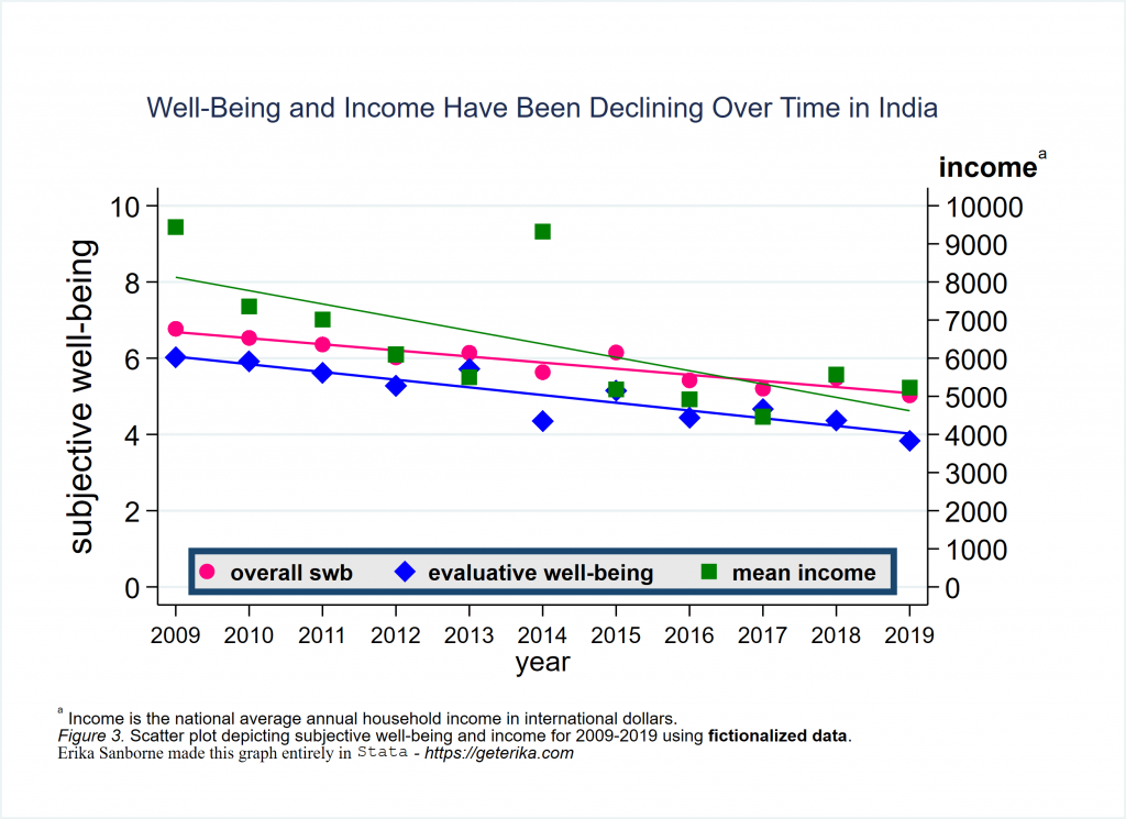
Again, run the code to try it out. Change settings and see how the display is altered. This is another useful graphing skill to understand for plotting descriptives. Here I have two scatterplots and I placed the linear fit line for each with it, color coded and omitted from the legend so as to not congest it. If the two measures did not have the same exact scale (which these two do have), you could use twoway to generate another y axis on the right. For example, you could scatter meanincome year and put a fit line in here of lfit meanincome year, and then you would have axis 2 to label for the range of values for income. Go ahead, try it. Can you find all the places you’d need to adjust to add that axis? I will show you next.
Here is the goal:
And here is the code to make a simplified (unformatted) version of it. I’m sharing this so you can see how it works. I’ll share the full, formatted code below.
twoway (scatter meanswb year, ms(O) color(pink) msize(medium) yaxis(1)) ///
(lfit meanswb year, pstyle(p1) lstyle(solid) lcolor(pink) yaxis(1))  ///
(scatter meanladderAve year, ms(D) color(blue) msize(medium) yaxis(1)) ///
(lfit meanladderAve year, pstyle(p2) lstyle(solid) lcolor(blue) yaxis(1)) ///
(scatter meanincome year, ms(S) color(green) msize(medium) yaxis(2)) ///
(lfit meanincome year, pstyle(p3) lstyle(dash) lcolor(green) yaxis(2)), ///
name(noformat1, replace)
The above code makes this unformatted twoway graph:
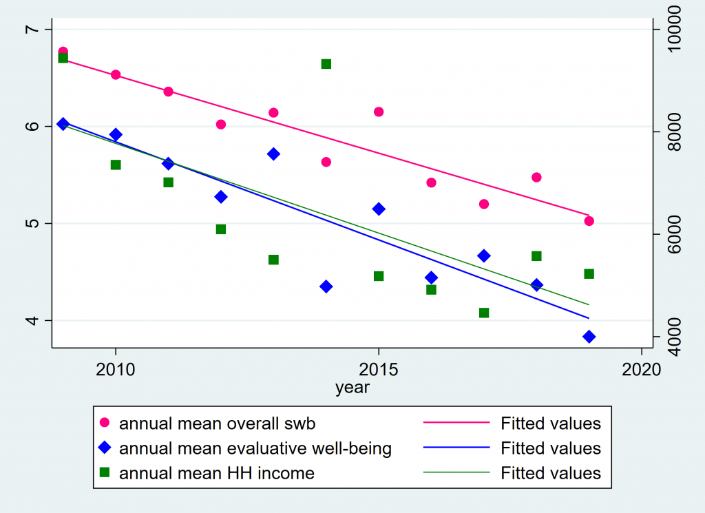
Not very satisfying, but necessary to first see how yaxis(2) works. You can have more than one xaxis also. And you can have flip which side a yaxis is on, using yscale(alt axis(2)) to alternate where axis(2) goes or yscale(alt axis(1)) to alternate where axis(1) goes, although you can omit axis(1) since it is the default and assumed whenever not specified. Read the graph twoway documentation for more if you’re interested. Here is the code for my Figure 3 as formatted:
*Figure 3
*multiple scatter plots of different variables on the same plot
*adding a second y axis with separate scale
twoway (scatter meanswb year, ms(O) color(pink) msize(medium) yaxis(1)) ///
(lfit meanswb year, pstyle(p1) lstyle(solid) lcolor(pink) yaxis(1))  ///
(scatter meanladderAve year, ms(D) color(blue) msize(medium) yaxis(1)) ///
(lfit meanladderAve year, pstyle(p2) lstyle(solid) lcolor(blue) yaxis(1)) ///
(scatter meanincome year, ms(S) color(green) msize(medium) yaxis(2)) ///
(lfit meanincome year, pstyle(p3) lstyle(dash) lcolor(green) yaxis(2)), ///
       ylabel(0(2)10, angle(horizontal)) ///
       yscale(range(0 10)) ///
       ytitle("subjective well-being", size(*1.2) margin(medium)) ///
       ylabel(0(1000)10000, angle(h) axis(2)) ///
       yscale(range(4000(1000)10000) axis(2)) ///
       ytitle(" ", size(*1.2) margin(medium) axis(2)) ///
legend(label(1 "{bf:overall swb}") ///
	   label(3 "{bf:evaluative well-being}") ///
	   label(5 "{bf:mean income}") ///
       order(1 3 5) rows(1) pos(6) ring(0) size(small) ///
	   region(fcolor(dimgray) lcolor(navy) lwidth(thick) margin(small))) ///
graphregion(fcolor(white)) ///
xlabel(2009(1)2019, labsize(small)) ///
text(11 2019.3 "{bf:income}{sup:a}", placement(e) tstyle(body)) ///
title("Well-Being and Income Have Been Declining Over Time in India", linegap(1.0) margin(large) size(*.7)) ///
caption("{sup:a} Income is the national average annual household income in international dollars." ///
"{it:Figure 3.} Scatter plot depicting subjective well-being and income for 2009-2019 using {bf:fictionalized data}." ///
"{stSerif:Erika Sanborne made this graph entirely in} {stMono:Stata} {it:- https://geterika.com}", size(*0.6) span margin(medium)) ///
name(figure3, replace)
graph export figure3.svg, replace
Lots of detail between the noformat1 and figure3 plots, right? You can decide how much you need. You might be satisfied with less customizing than what I have shown in Figure 3. Again I tried to show a variety of graph customization techniques. Notice where you can change color, shape, line thickness, marker size, margin size, clockposition of various things, order of what appears in the legend, etc.
Now let’s get into regression models and predictive margins so we can get to plotting those next.
*load the demo data file
use https://geterika.com/downloads/demo1, clear

*run the regression first (btw coefplot works with all kinds of models)

ologit INDEX_LER  c.logincome i.counton i.healthprob i.Prosocial i.freedom  ///
i.corruptind i.education i.gender c.logage i.hindu ///
if year==2009, vce(robust) or
estimate store ologit09

*and this is coefplot. You did run initial-erika-setup.do already, right?
coefplot, name(noformat2, replace)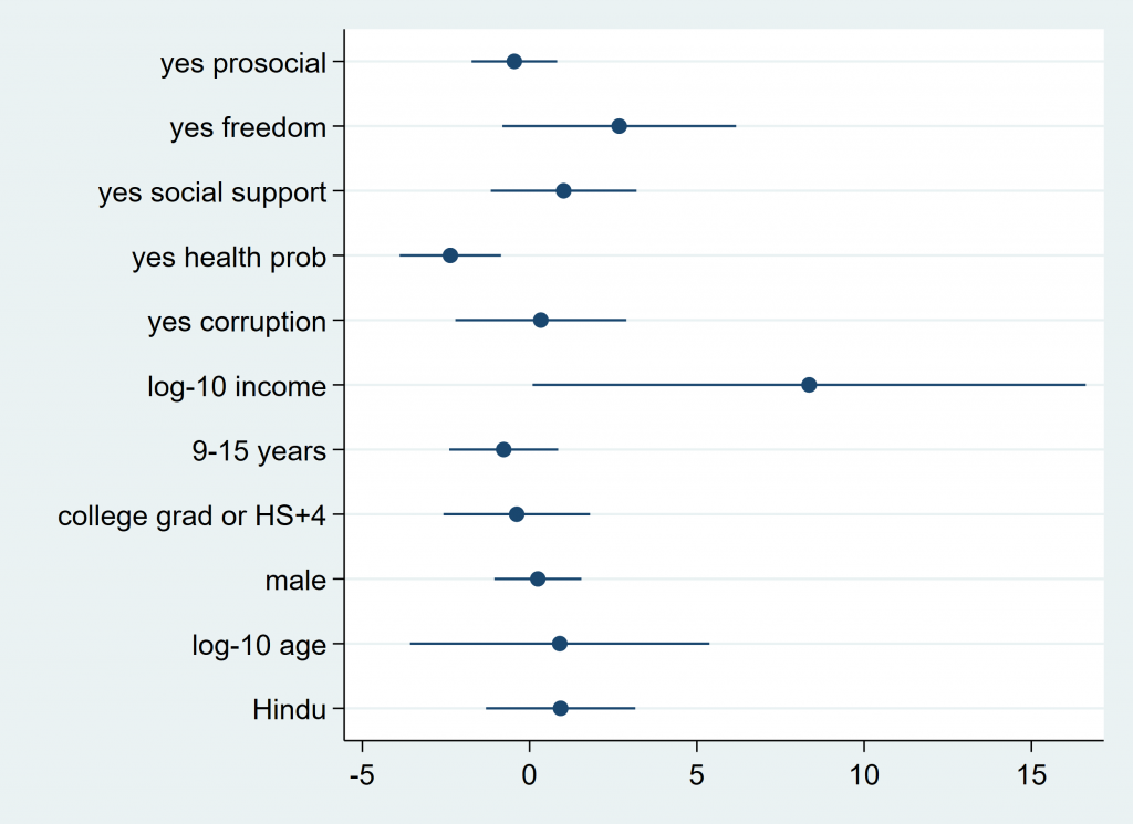
When you have just run a model and want to quickly visualize the coefficients, coefplot is an excellent choice of the very next thing to type. It will give you something like the above. It’s useful. The lines projecting out are confidence intervals, and you can see how far from 0 your coefficients are, how they vary from one another, and just get a sense of what your model came up with.
Coefplot can also be customized way better than some other options, and it’s one of my all-time favorite user written programs. I heart coefplot… What I’d like to show you next is a few iterations of what you can do with coefplot. First, I’ll show you one way of formatting the plot you see above. Then, I’ll show you a trick I learned about how to show which points are significant (this is very smooth, I have to say). Lastly, I will show you how to plot multiple models in one graph. All useful. You ready?
Here is a nicely formatted, straightforward coefplot, IMO:
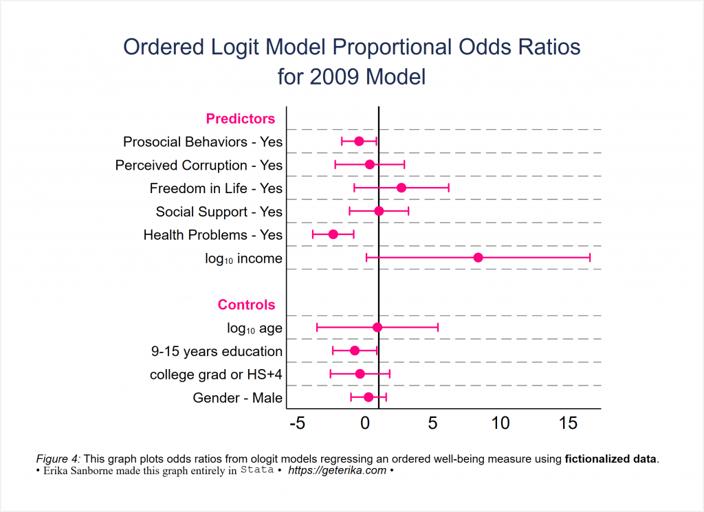
You can (and probably should) lose the pink. I just really find the pink on white pleasing, sorry. Use your own color scheme. (Side note: You can use grstyle, which is what I normally use, or at least choose a scheme. Run graph query, schemes and then set scheme -yourchosenschemehere- to try one out.)
Notice several things in the following code for Figure 4 in particular: Notice I rewrote my coeflabels, chose the order in which I wanted coefficients to appear, placed an xline at x=1, and you might want that elsewhere in other models, used drop to omit things that were in the model that I did not want plotted, and inserted headings to group my coefficients into predictors and controls, by naming which coefficient they should be placed above. Obviously this is just an illustration with a fictionalized data set, but I’m sure you can imagine that you might want to group coefficients in some substantively meaningful way too. This is good technique to get familiar with.
coefplot ///
(ologit09, label(2009) mcolor(pink) mlabcolor(pink) msymbol(O) ///
ciopts(color(pink) recast(rcap))) ///
, ///
drop(_cons | *.hindu) ///
aspect(1) ///
graphregion(fcolor(white)) ///
xlabel(, notick) ///
grid(between glpattern(dash) glwidth(*0.5) glcolor(gray)) ///
ylabel(,labsize(small) notick) ///
xline(1, lwidth(medium) lcolor(black) lpattern(solid)) ///
order (*.Prosocial *.corruptind *.freedom *.counton *.healthprob ///
logincome logage *.education *.gender *.hindu) ///
headings( ///
logage = "{bf:Controls}" ///
1.Prosocial = "{bf:Predictors}", ///
labcolor(pink) labsize(small)) ///
coeflabels( ///
1.Prosocial = "Prosocial Behaviors - Yes" ///
1.freedom = "Freedom in Life - Yes" ///
1.corruptind = "Perceived Corruption - Yes" ///
1.counton = "Social Support - Yes" ///
1.healthprob = "Health Problems - Yes" ///
1.gender = "Gender - Male" ///
logincome = "log{subscript:10} income" ///
logage = "log{subscript:10} age" ///
2.education = "9-15 years education") ///
title("Ordered Logit Model Proportional Odds Ratios" "for 2009 Model", ///
span size(*.9) linegap(1.5) margin(medium)) ///
note("{it:Figure 4:} This graph plots odds ratios from ologit models regressing an ordered well-being measure using {bf:fictionalized data}." ///
"{&bullet} {stSerif:Erika Sanborne made this graph entirely in} {stMono:Stata} {&bullet} {it: https://geterika.com} {&bullet} ", span size (*.8) margin(medium)) ///
name(Figure4, replace)
graph export Figure4.svg, replace
This next iteration is nearly the same as the previous. I’m just adding in one cool new thing. Check this out.
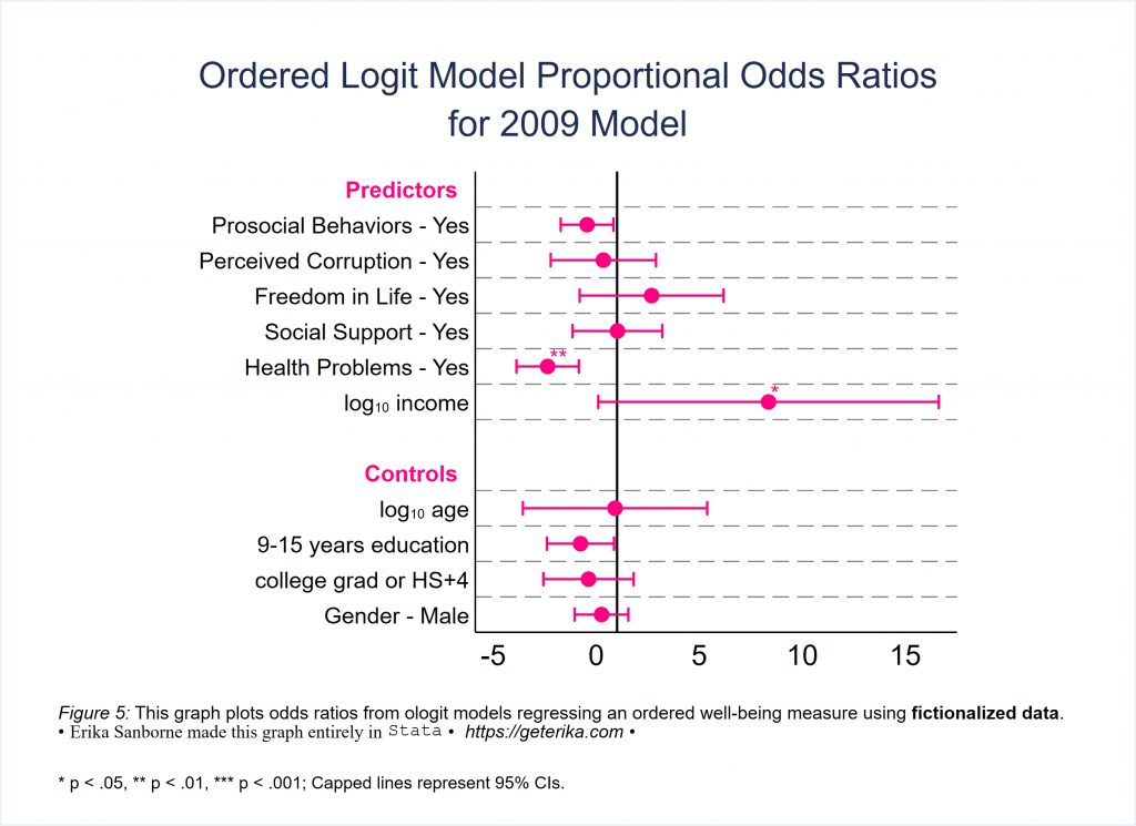
How cool is that? Significance stars automatically on your coefplot… I will put the difference between the code for Figures 4 and 5 in bold so you can see what you’re adding to make the significance stars. This is possibly the most awesome trick in this tutorial.
coefplot ///
(ologit09, label(2009) mcolor(pink) mlabcolor(pink) msymbol(O) ///
ciopts(color(pink) recast(rcap))), ///
drop(_cons | *.hindu) ///
aspect(1) ///
graphregion(fcolor(white)) ///
xlabel(, notick) ///
grid(between glpattern(dash) glwidth(*0.5) glcolor(gray)) ///
ylabel(,labsize(small) notick) ///
xline(1, lwidth(medium) lcolor(black) lpattern(solid)) ///
order (*.Prosocial *.corruptind *.freedom *.counton *.healthprob ///
logincome logage *.education *.gender *.hindu) ///
headings( ///
logage = "{bf:Controls}" ///
1.Prosocial = "{bf:Predictors}" ///
, ///
labcolor(pink) labsize(small)) ///
msize(medium) ///
mlabel(cond(@pval<.001, "***", ///
cond(@pval<.01, "**", ///
cond(@pval<.05, "*", ///
cond(@pval>.05, "", ///
string(@pval,"%9.3f")))))) ///
mlabposition(2) mlabgap(-.5) mlabsize(small) ///
coeflabels( ///
1.Prosocial = "Prosocial Behaviors - Yes" ///
1.freedom = "Freedom in Life - Yes" ///
1.corruptind = "Perceived Corruption - Yes" ///
1.counton = "Social Support - Yes" ///
1.healthprob = "Health Problems - Yes" ///
1.gender = "Gender - Male" ///
logincome = "log{subscript:10} income" ///
logage = "log{subscript:10} age" ///
2.education = "9-15 years education") ///
title("Ordered Logit Model Proportional Odds Ratios" "for 2009 Model", span size(*.9) linegap(1.5) margin(medium)) ///
note("{it:Figure 5:} This graph plots odds ratios from ologit models regressing an ordered well-being measure using {bf:fictionalized data}." ///
"{&bullet} {stSerif:Erika Sanborne made this graph entirely in} {stMono:Stata} {&bullet} {it: https://geterika.com} {&bullet} ", span size (*.8) margin(medium)) ///
caption("     * p < .05, ** p < .01, *** p < .001; Capped lines represent 95% CIs.", span size(*.6)) ///
name(Figure5, replace)
graph export Figure5.svg, replace
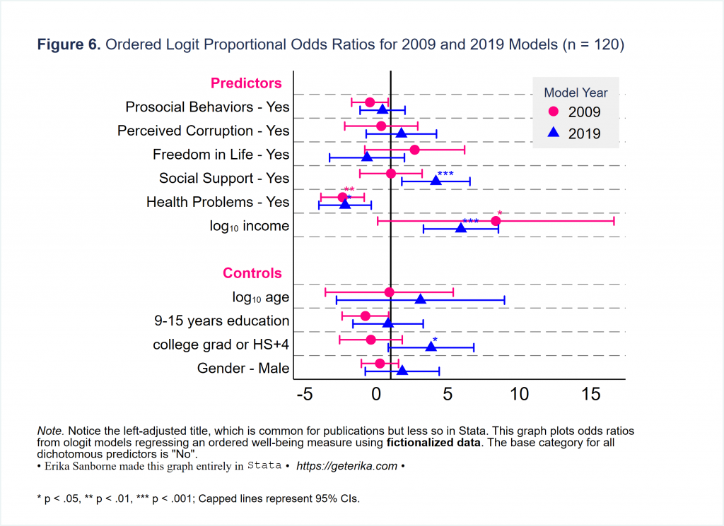
Okay, as much as I love coefplot I will move on after sharing one more illustration: multiple models in one graph. This is a great use of coefplot in my opinion. What do you think? By the way, the docs for coefplot are really user-friendly. Check them out sometime. (Spoiler alert: We’re never really done with coefplot. It’ll resurface.)
*let's get a second model to compare

ologit INDEX_LER  c.logincome i.counton i.healthprob i.Prosocial i.freedom  ///
i.corruptind i.education i.gender c.logage i.hindu ///
if year==2019, vce(robust) or
estimate store ologit19

*and now coefplot for Figure 6
coefplot (ologit09, label(2009) mcolor(pink) mlabcolor(pink) ///
ciopts(color(pink) recast(rcap))) ///
(ologit19, label(2019) mcolor(blue) mlabcolor(blue) msymbol(T) ///
ciopts(color(blue) recast(rcap))), ///
drop(_cons | *.hindu) ///
aspect(1) ///
graphregion(fcolor(white)) ///
xlabel(, notick) ///
grid(between glpattern(dash) glwidth(*0.5) glcolor(gray)) ///
ylabel(,labsize(small) notick) ///
xline(1, lwidth(medium) lcolor(black) lpattern(solid)) ///
order (*.Prosocial *.corruptind *.freedom *.counton *.healthprob ///
logincome logage *.education *.gender *.hindu) ///
headings( ///
logage = "{bf:Controls}" ///
1.Prosocial = "{bf:Predictors}" ///
, ///
labcolor(pink) labsize(small)) ///
msize(medium) ///
mlabel(cond(@pval<.001, "***", ///
cond(@pval<.01, "**", ///
cond(@pval<.05, "*", ///
cond(@pval>.05, "", ///
string(@pval,"%9.3f")))))) ///
mlabposition(2) mlabgap(-.5) mlabsize(small) ///
coeflabels( ///
1.Prosocial = "Prosocial Behaviors - Yes" ///
1.freedom = "Freedom in Life - Yes" ///
1.corruptind = "Perceived Corruption - Yes" ///
1.counton = "Social Support - Yes" ///
1.healthprob = "Health Problems - Yes" ///
1.gender = "Gender - Male" ///
logincome = "log{subscript:10} income" ///
logage = "log{subscript:10} age" ///
2019.decade = "2019 (vs. 2009)" ///
2.education = "9-15 years education" ///
age2 = "age{superscript:2}") ///
legend(position(2) ring(0) title("Model Year", size(*.5)) size(small) ///
   cols(1) region(lwidth(none) fcolor(gs15)) ) ///
title("{bf:Figure 6.} Ordered Logit Proportional Odds Ratios for 2009 and 2019 Models (n = 120)", span position(11) size(*.6) margin(medium)) ///
note("{it:Note.} Notice the left-adjusted title, which is common for publications but less so in Stata. This graph plots odds ratios" ///
"from ologit models regressing an ordered well-being measure using {bf:fictionalized data}. The base category for all" ///
`"dichotomous predictors is "No"."' ///
"{&bullet} {stSerif:Erika Sanborne made this graph entirely in} {stMono:Stata} {&bullet} {it: https://geterika.com} {&bullet} ", span size (*.8) margin(medium)) ///
caption("     * p < .05, ** p < .01, *** p < .001; Capped lines represent 95% CIs.", span size(*.6)) ///
name(Figure6, replace)
graph export Figure6.svg, replace
Let’s plot some Average Marginal Effects, yeah?
I will renew my suggestion that you read Long & Freese (2012), “Regression Models for Categorical Variables.” It’s one of the most well-worn books in my office. For this tutorial, I’m just going to show a couple marginsplot graphs. I will often combine them, sometimes using combomarginsplot (SSC), and sometimes I will plot the margins with coefplot, because it gives greater control. But here, I’m just showing you a few standalone marginsplots, the regular kind, with two of what seem to be the more popular ways to style them. Okay? Let’s dig in.
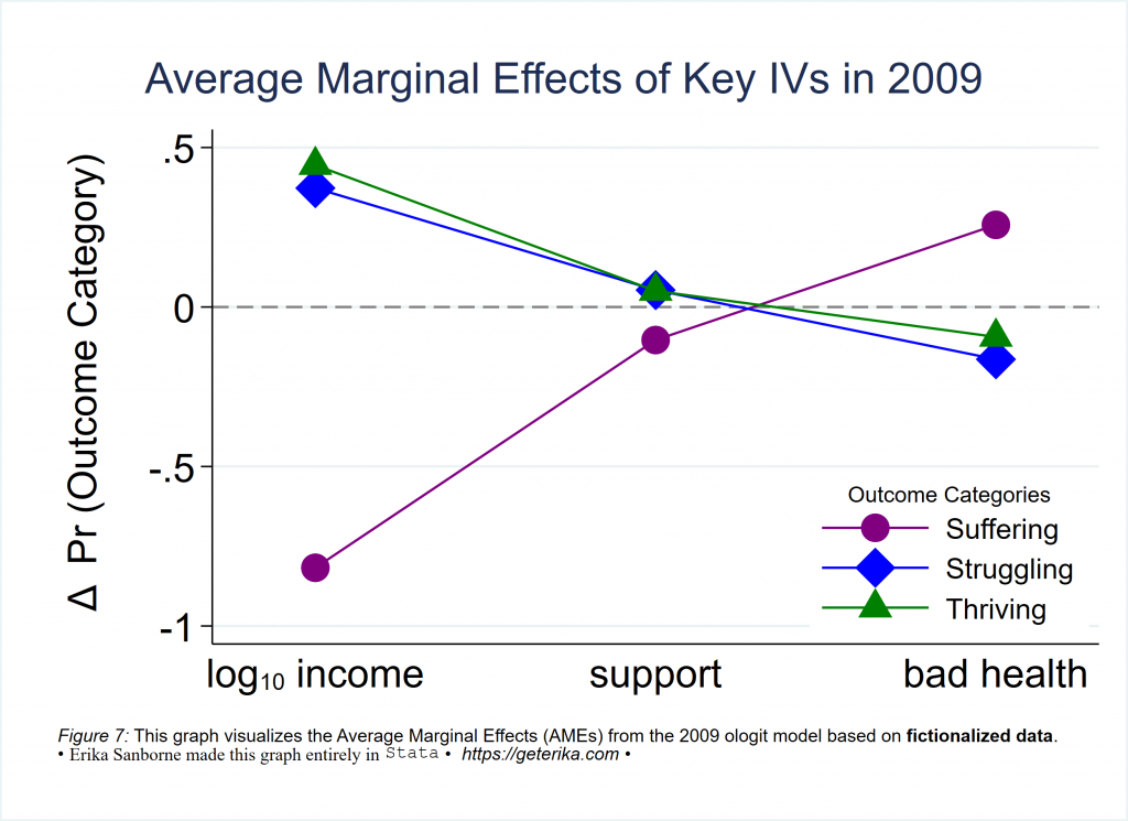
So Figure 7 shows one way how to format marginsplot in Stata. The CIs are supressed, and this is for an ologit model so the AMEs are shown here for key explanatory variables, and the picture shows how a change in those xaxis variables changes the probability of having a different outcome category according to the model, right? Here is the code to make Figure 7.
*AMEs for 2009
*regression first
/*
ologit INDEX_LER  c.logincome i.counton i.healthprob i.Prosocial i.freedom  ///
i.corruptind i.education i.gender c.logage i.hindu ///
if year==2009, vce(robust) or
estimate store ologit09
*/
estimates restore ologit09
*then margins
margins, dydx(logincome counton healthprob)

*BTW, when you just want a quick visualization for yourself, just do this:
marginsplot, name(noformat3, replace)

*when you want a formatted margins plot, here is Figure 7
marginsplot, noci allsimplelabels ///
plot1opts(lpattern(solid) ms(O) color(purple) msize(vlarge) ) ///
plot2opts(lpattern(solid) ms(D) color(blue) msize(vlarge) ) ///
plot3opts(lpattern(solid) ms(T) color(green) msize(vlarge) ) ///
xlabel(1 "log{subscript:10} income" 3 "support" 5 "bad health", ///
notick labsize(large)) ///
xscale(range(0.5(1)5.5)) ///
yline(0, lcolor(gray) lpattern(dash) lwidth(medium)) ///
ylabel(, angle(horizontal) labsize(large)) ///
ytitle(" {&Delta}  Pr (Outcome Category)", margin(medium) size(large)) ///
xtitle("") ///
title("Average Marginal Effects of Key IVs in 2009", size(*1.2) span margin(medium)) ///
legend(order(1 "Suffering" 2 "Struggling" 3 "Thriving") cols(1) ///
position(4) ring(0) region(lwidth(none)) subtitle("Outcome Categories", size(*.7)) ) ///
graphregion(fcolor(white)) ///
note("{it:Figure 7:} This graph visualizes the Average Marginal Effects (AMEs) from the 2009 ologit model based on {bf:fictionalized data}." ///
"{&bullet} {stSerif:Erika Sanborne made this graph entirely in} {stMono:Stata} {&bullet} {it: https://geterika.com} {&bullet} ", span size (*.8) margin(medium)) ///
name(Figure7, replace)
graph export Figure7.svg, replace
Here is another way to do marginsplot – same model contents, different visual choices.
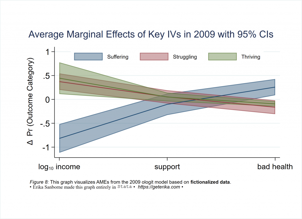
*and here is the code to make Figure 8 marginsplot
estimates restore ologit09
*then margins
margins, dydx(logincome counton healthprob)
*now Figure 8 marginsplot AMEs for 2009
marginsplot, allsimplelabels ///
recast(line) ciopt(color(%50)) recastci(rarea) ///
xlabel(1 "log{subscript:10} income" 3 "support" 5 "bad health") ///
ylabel(, angle(horizontal) labsize(medium)) ///
ytitle(" {&Delta}  Pr (Outcome Category)", margin(small) ) ///
xtitle("") ///
title("Average Marginal Effects of Key IVs in 2009 with 95% CIs", span margin(medium)) ///
legend(order(1 "Suffering" 2 "Struggling" 3 "Thriving") rows(1) ///
position(12) ring(0) size(*.7) region(lwidth(none))) ///
graphregion(fcolor(white) margin(10 10 10 10)) ///
note("{it:Figure 8:} This graph visualizes AMEs from the 2009 ologit model based on {bf:fictionalized data}." ///
"{&bullet} {stSerif:Erika Sanborne made this graph entirely in} {stMono:Stata} {&bullet} {it: https://geterika.com} {&bullet} ", span size (*.8) margin(medium)) ///
name(Figure8, replace)
graph export Figure8.svg, replace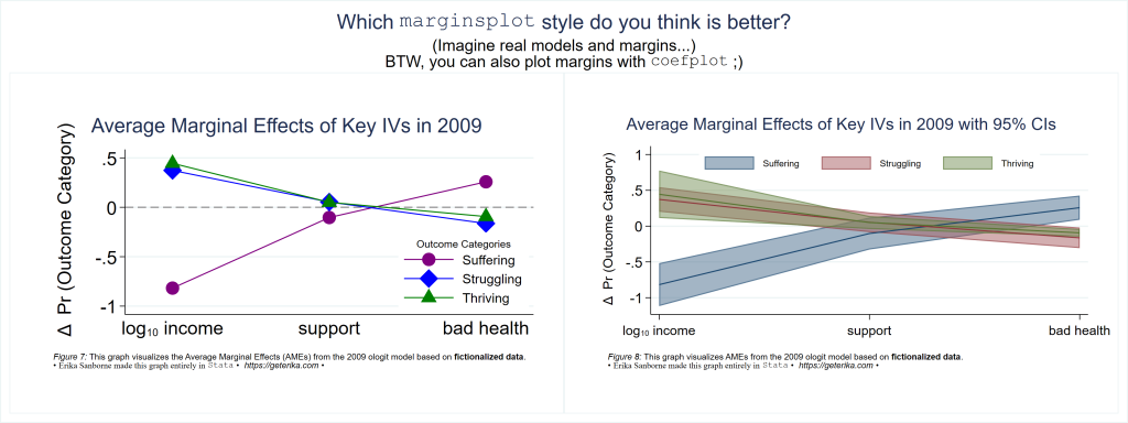
Okay. I am very aware of the limitations of relying on just one number (i.e. an Average Marginal Effect) to predict the effect on probability (or on the proportional odds ratio, or whatever) of a different outcome. Relationships among our categorical variables are usually nonlinear and interactive, right? These single numbers cannot capture that complexity. For example, that’s great to know that (using the fictionalized data set from this tutorial) income decreases the odds of suffering so much. Cool. But is that true for everybody in the population? How can we capture and represent that nuance?
I agree with Long & Freese (2012) that ideal types are the way to go here. Compute predictive margins at important values of our explanatory variables. Now those will be meaningful predictive margins! Let’s see if I can find any of them in the fictionalized data set…standby…
Got it! Check this out. Health problems (a.k.a. disability), income, and social support are all significant in the 2019 model in the fictionalized data set. So it makes sense to look at probabilities for outcomes based on “ideals types” for people with high and low income, with and without disability, with and without social support. See the plots below, followed by a few comments and then the code to make all of it happen with the fictionalized data set.
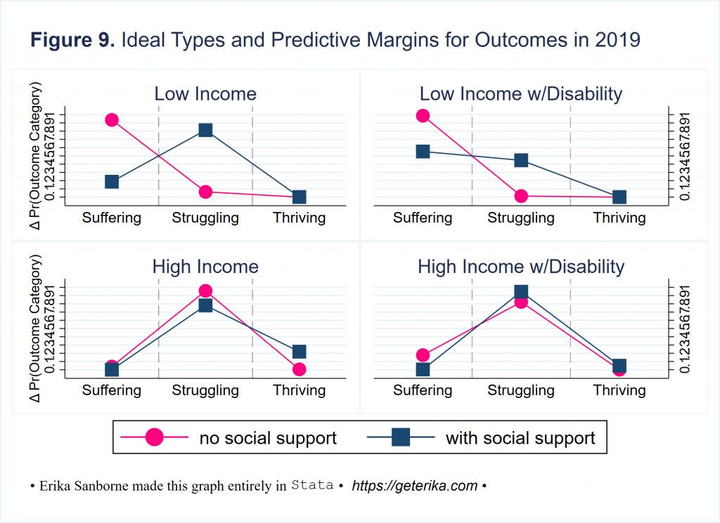
It’s readable, right? In one graphical depiction, you can convey anything you want about your key findings. What do you see in that four-pack of plots up there in Figure 9?
Here is what I see: Disability does not seem to affect well-being for high income people much at all. What else? Surprisingly most high income people are struggling across the board, neither suffering nor thriving. Social support reduces probability of suffering for low income people with and without a disability, with greater impact on those without a disability, but ain’t nobody’s likelihood of thriving going up if they are low income no matter how many friends they have, as those pink circles are fully obscured at the zero for thriving in both plots of predictive margins for low income ideal types. And this isn’t super confusing, right? It should be accessible, the kind of results you can convey to anyone.
Here’s the code I used to produce Figure 9. Restore the model or run it, then get margins at representative values, then plot them in a way that makes sense, using the techniques from earlier in this tutorial.
/*
ologit INDEX_LER  c.logincome i.counton i.healthprob i.Prosocial i.freedom  ///
i.corruptind i.education i.gender c.logage i.hindu ///
if year==2019, vce(robust) or
estimate store ologit19
*/

*compute predictive margins at representative values (MERs)


*A: low inc + no supp
 estimates restore ologit19
 margins, ///
 at(logincome=3.04 counton=0 (mean) gender freedom healthprob Prosocial corruptind education logage hindu ) post
 estimate store personA
*B: low inc w/supp
 estimates restore ologit19
 margins, ///
 at(logincome=3.04 counton=1 (mean) gender freedom healthprob Prosocial corruptind education logage hindu ) post
 estimate store personB
*C: low inc + disabled + no supp
 estimates restore ologit19
 margins, ///
 at(logincome=3.04 healthprob=1 counton=0 (mean) gender freedom Prosocial corruptind education logage hindu ) post
 estimate store personC
*D: low inc + disabled w/supp
 estimates restore ologit19
 margins, ///
 at(logincome=3.04 healthprob=1 counton=1 (mean) gender freedom Prosocial corruptind education logage hindu ) post
 estimate store personD
*E: high inc + no support
 estimates restore ologit19
 margins, ///
 at(logincome=4.04 counton=0 (mean) gender freedom healthprob Prosocial corruptind education logage hindu ) post
 estimate store personE
*F: high inc w/support
 estimates restore ologit19
 margins, ///
 at(logincome=4.04 counton=1 (mean) gender freedom healthprob Prosocial corruptind education logage hindu ) post
 estimate store personF
*G: high inc + disabled + no supp
 estimates restore ologit19
 margins, ///
 at(logincome=4.04 healthprob=1 counton=0 (mean) gender freedom Prosocial corruptind education logage hindu ) post
 estimate store personG
*H: high inc + disabled w/supp
 estimates restore ologit19
 margins, ///
 at(logincome=4.04 healthprob=1 counton=1 (mean) gender freedom Prosocial corruptind education logage hindu ) post
 estimate store personH


*INDIVIDUAL IDEAL TYPE PLOTS

*Low Income
coefplot ///
(personA, label(no social support) mcolor(pink) msize(vlarge) mlabcolor(pink) lcolor(pink) msymbol(O) noci recast(connected)) ///
(personB, label(with social support) mcolor(navy) msize(vlarge) mlabcolor(navy) lcolor(navy) msymbol(S) noci recast(connected) ) ///
, ///
grid(between glpattern(dash) glwidth(*0.5) glcolor(gray)) ///
legend(position(6) rows(1)) ///
ytitle("Δ Pr(Outcome Category)") ///
ylabel(0(0.1)1.0) yscale(range(0(0.1)1.0)) ///
xtitle("") ///
xlabel(1 "Suffering" 2 "Struggling" 3 "Thriving", notick labsize(medium)) ///
title("Low Income", size(*1)) ///
vertical nooffset graphregion(fcolor(white) ) ///
name(ITlowincome, replace)

*Low Income w/Disability
coefplot ///
(personC, label(no social support) mcolor(pink) msize(vlarge) mlabcolor(pink) lcolor(pink) msymbol(O) noci recast(connected)) ///
(personD, label(with social support) mcolor(navy) msize(vlarge) mlabcolor(navy) lcolor(navy) msymbol(S) noci recast(connected) ) ///
, ///
grid(between glpattern(dash) glwidth(*0.5) glcolor(gray)) ///
legend(position(6) rows(1)) ///
ytitle("") yscale(alt) ///
ylabel(0(0.1)1.0) yscale(range(0(0.1)1.0)) ///
xtitle("") ///
xlabel(1 "Suffering" 2 "Struggling" 3 "Thriving", notick labsize(medium)) ///
title("Low Income w/Disability", size(*1)) ///
vertical nooffset graphregion(fcolor(white) ) ///
name(ITlowincomedisabled, replace)

*High Income
coefplot ///
(personE, label(no social support) mcolor(pink) msize(vlarge) mlabcolor(pink) lcolor(pink) msymbol(O) noci recast(connected)) ///
(personF, label(with social support) mcolor(navy) msize(vlarge) mlabcolor(navy) lcolor(navy) msymbol(S) noci recast(connected) ) ///
, ///
grid(between glpattern(dash) glwidth(*0.5) glcolor(gray)) ///
legend(position(6) rows(1)) ///
ytitle("Δ Pr(Outcome Category)") ///
ylabel(0(0.1)1.0) yscale(range(0(0.1)1.0)) ///
xtitle("") ///
xlabel(1 "Suffering" 2 "Struggling" 3 "Thriving", notick labsize(medium)) ///
title("High Income", size(*1)) ///
vertical nooffset graphregion(fcolor(white) ) ///
name(IThighincome, replace)

*High Income w/Disability
coefplot ///
(personG, label(no social support) mcolor(pink) msize(vlarge) mlabcolor(pink) lcolor(pink) msymbol(O) noci recast(connected)) ///
(personH, label(with social support) mcolor(navy) msize(vlarge) mlabcolor(navy) lcolor(navy) msymbol(S) noci recast(connected) ) ///
, ///
grid(between glpattern(dash) glwidth(*0.5) glcolor(gray)) ///
legend(position(6) rows(1)) ///
ytitle("") yscale(alt) ///
ylabel(0(0.1)1.0) yscale(range(0(0.1)1.0)) ///
xtitle("") ///
xlabel(1 "Suffering" 2 "Struggling" 3 "Thriving", notick labsize(medium)) ///
title("High Income w/Disability", size(*1)) ///
vertical nooffset graphregion(fcolor(white) ) ///
name(IThighincomedisabled, replace)


grc1leg ITlowincome ITlowincomedisabled IThighincome IThighincomedisabled, ///
rows(2) ///
title("{bf:Figure 9.} Ideal Types and Predictive Margins for Outcomes in 2019", ///
position(11) span size(*.8) margin(medium)) ///
caption("{&bullet} {stSerif:Erika Sanborne made this graph entirely in} {stMono:Stata} {&bullet} {it: https://geterika.com} {&bullet} " ///
, span size(*.8) margin(medium) ) graphregion(fcolor(white)) ///
name(Figure9, replace)
graph export Figure9.svg, replace
graph close ITlowincome ITlowincomedisabled IThighincome IThighincomedisabled
This should keep me busy for a while. Thanks for sharing it!
You are welcome! 🙂
Great article.
Thanks for sharing!
Have you considered using the technique of using local macros to specify options and/or text strings for chart elements? It’s something I found in J. Scott Long’s “The Workflow of Data Analysis Using Stata.” For example, you could try
local credit_text “{&bullet} {stSerif:Erika Sanborne made this graph entirely in} {stMono:Stata} {&bullet} {it: https://geterika.com} {&bullet}”
and then use this in all the charts. This might help with consistency, since figures 1&3 lack the leading bullet that the later charts have, and figure 2 has a leading heart instead of a bullet.
Long goes further and creates a local macro for the options of each chart element, which helps to make the code more readable. For example, part of figure1 could look something like
…
local opt_line “lcolor(black) lwidth(thick)”
local opt_ytitle “linegap(1.5) margin(medium)”
local opt_text “placement(ne) tstyle(smbody)”
…
yline( 6.77, `opt_line’) ///
yline( 5.03, `opt_line’) ///
ytitle( “`ytitle_text'”, `opt_ytitle’) ///
text(2.65 100 “2019 Mean SWB {&rarr}”, `opt_text’) ///
text(6.8 100 “{&larr} 2009 Mean SWB”, `opt_text’) ///
text(9.6 85 “25%”, `opt_text’) ///
text(9.6 65 “75%”, `opt_text’) ///
text(9.6 30 “45%”, `opt_text’) ///
text(9.6 10 “55%”, `opt_text’) ///
…
Hi Joe,
Yes, you should definitely use local macros any time you’ve got something worth storing that you’re going to recall again within the same do file. I was not aiming for the stylistic consistency in this demo (i.e. bullet versus heart, which varies deliberately here as I’m trying to show folks some of the possibilities) but I intentionally did not use local macros in this demo because I try to not include too many things that I’m not also explaining, and some people use my demos in pieces and will lose the storage of the local macro if they do not run the whole file.
That said, if you are already familiar with local macros, definitely that is a good choice. I will also probably explain and use local macros in my next demo, to cover this better.
Thanks for commenting.
Happy New Year,
Erika
Thanks very much for your content — I’ve got a question, however.
I’m running a logit model in stata with 6 IVs, all with very different ranges and one is a dummy variable. For clarity purposes, I don’t want to standardize my variables.
I’d like to create a graph, similar in style to the one you’ve titled “Ordered Logit Model Proportional Odds Ratios”, however I want the x-axis to be “change in predicted probability when moving from min to max of each variable”. I’ve seen people do this in R (but I can’t proficiently use R), and I cannot, for the life of me, figure out how to do this in Stata.
Any help would be greatly appreciated!
Hello, person-without-a-name. I’m not really sure what you are going for here, my friend. I have many more questions than answers based on your post, so I cannot really comment with a magical fix. If I could, I would. What I’d suggest though is to take this one to statalist. Be sure to include a usable extract of your data, using dataex, and reproducable Stata code that shows what you have done and what it produces, and then specify what you are trying to accomplish. Good luck.
Hi Erika,
Thanks for this webpage. Super helpful. ONe question about coefplot: do you know how to make the titles in option headings of different color? I.e. in your example, to make “predictors” and “control”of two different color?
Thanks
Hello, person-who-didn’t-leave-their-name, 🙂
Let me clarify what you’re asking about here. You want to make headings() in coefplot to be two different colors? So, using my Figure 6 for example, to make the coefplot option headings of Predictors and Controls be two different colors?
You can make them the same, singular color that is not pink, certainly. It is set in the headings () label color property, currently pink. Change that to labcolor(black) or labcolor(whatever-you-want) within headings(labcolor()).
But it sounds like you are asking whether you can make them be two different colors, right?
Alas, that is not possible. We can do a lot with Stata visuals, and with text for this particular headings field within coefplot, you can edit it to the extent that you can apply SMCL tags (reference help graph_text). But the color will be as set in labcolor(pink) in my example.
Cheers & happy coding and graphing to you in 2023.
Thank you for the coding tips. Very nice. How can you have negative numbers in your odds ratio coef plots?
Hello, “DML” –
Odds ratios cannot be negative but coefficients in an ordered logit model can be.
And I see now that in my examples for Figures 4-6, I plotted the model’s coefficients and labeled them odds ratios – sorry for any confusion caused by that. Thank you for asking.
Folks, please use your real name, like on Statalist. It’s a courtesy I ask, as a real person hosting this blog, that you say who you are when you post.
Thanks. ✌️
Hi Erika
Thanks for sharing your experience with graphics in Stata!
I would like to ask what are the best ways to graphically represent a panel model using xtgls model?
Hi Romildo,
Any data graph represents only some aspect of a model, right? Your question is very broad.
To choose the best graph to depict what you hope to convey to your readers, you need to decide what is meaningful, representative, relevant, helpful, etc.
Start by returning to basics. Are you fitting the right model? xtgls fits panel-data linear models by using feasible generalized least squares. It allows estimation in the presence of AR(1) autocorrelation,
corr(ar1) in Stata, within panels and cross-sectional correlation and heteroskedasticity across panels.
Fitting a good model? Cool.
Next, I would run relevant postestimation tests. For example, margins (marginal means, predictive margins, marginal effects, and average marginal effects) can be nice.
xtgls postestimation
Then decide what is meaningful, relevant, representative, and helpful to illustrate. I often like to graphically depict something from those postestimation commands. For example, marginsplot graphs the results from the margins command (so profile plots, interaction plots, etc.).
Hope this helps. Happy graphing in Stata. 🙂
Erika
thanks for now