Have you downloaded a delimited data file, or want to know how to reshape World Bank data and structure it into panel format using xtset in Stata? Want to make high quality data visualizations in Stata using xtline? Let’s do this.

With Data from Here
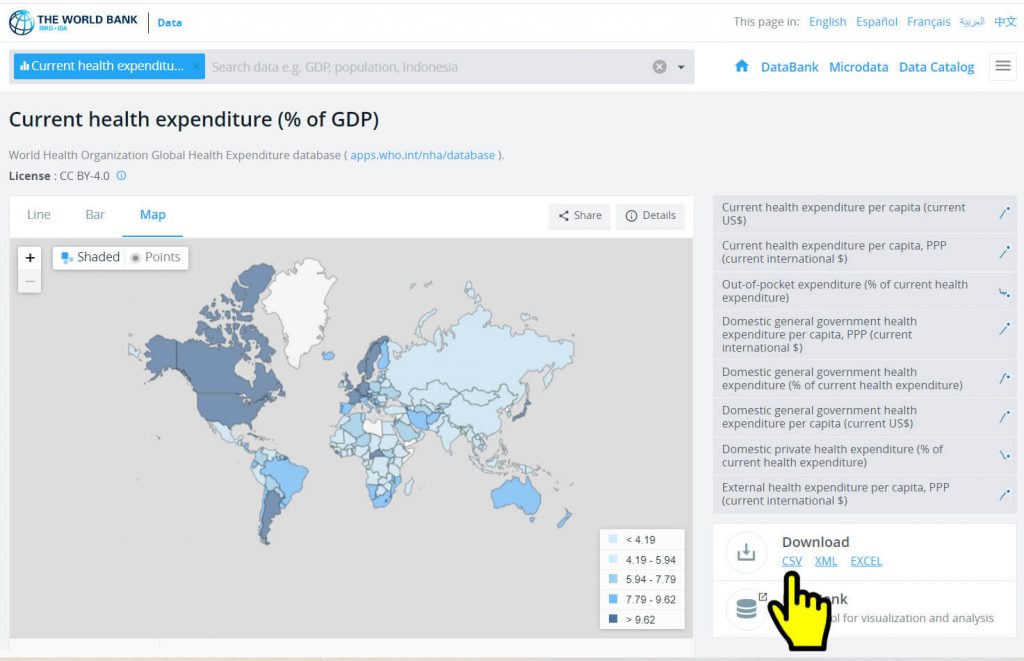
This tutorial uses the World Bank Current Health Expenditure (% of GDP) indicator download.
The data used in this tutorial are redistributed here in accordance with their Creative Commons Attribution 4.0 (CC-BY 4.0) International license, which “allows users to copy, modify and distribute data in any format for any purpose, including commercial use. Users are only obligated to give appropriate credit (attribution) and indicate if they have made any changes, including translations.”
You can either download your own CSV file from WorldBank, or you can download my HealthEx-From-WorldBank.dta, which I created as noted here.
We Will Make This Graph in Stata

We will clean the csv data download, learn how to reshape World Bank data using xtset in Stata, and then plot some observations using xtline for panel datasets.
The HealthEx-From-WorldBank.dta file used in this tutorial was constructed by first downloading the CSV file from the World Bank website.
Then, in Stata, I did the following:
import delimited "API_SH.XPD.CHEX.GD.ZS_DS2_en_csv_v2_3054013.csv"
//I deleted the top cases or rows that were empty.
//I deleted variables with missing observations for this indicator.
//I deleted unused variables.
//I renamed variables.
label data "Healthcare Expenditure per GDP (World Bank Estimate)"
saveold "HealthEx-From-WorldBank.dta", replace
Starting with my HealthEx-From-WorldBank.dta, let’s see how to reshape World Bank data for this indicator!
You can follow along with me or download World-Bank-demo.do, which is what I’m walking through next, step by step. You can download it and run it, since I host the data file used in that do file.
//  Loading data
clear all
use https://geterika.com/downloads/HealthEx-From-WorldBank, clear
/*If using an older version of Stata, you might encounter a Java runtime error [r(5100)]. If you do, just <right-click> + <save-as> that data file. Download it to your system and run from there as a workaround.
*/


*Step 1: Let's create a numeric "unique identifier" var for each countryCode
egen id = group(countryCode), label

tab id in 1/5 //btw it looks like you still don't have a numeric id var, right?
//You do tho! That's just a label you're seeing.
tab id in 1/5, nolabel //see? So we've got our unique numeric id variable set.

*Step 2: format longitudinal
//okay. Look at the data presently in WIDE format... go to Data Editor, or
list in 1/20

/* "healthex" is the first part of the indicator or variable names in the series
to be reshaped, aka the "stem"
"id" is the unique identifier we generated from on countryCode
"year" is the name of the new variable where the end parts of the original
variable names will be stored
*/

reshape long healthex, i(id) j(year)


//and let's clean things up real quick...
label variable healthex "mean annual health expenditure (% of GDP)"
label values healthex healthex
drop countryCode indicator //don't need these
label variable year "year"
label values year year
label variable country "country name"

//and now look at the data in LONG format... Data Editor, or:
list in 10/30


*Step 3: Make it a panel data set
//Ready? Let's make it official and XTSET our data
xtset id year


* Step 4: Done! Or "profit!" as we said in my day.
codebook, compact
xtsum //we can now do stuff with this panel data set


//generating a few variables that will be used in graphs
//some starting position options for labels
gen pos1 = 1
gen pos2 = 2
gen pos3 = 3
gen pos4 = 4
gen pos5 = 5
gen pos10 = 10
gen pos11 = 11
gen pos12 = 12

generate healthexr = round(healthex,0.01) //creating a rounded version
gen healthexrlab = string(healthexr, "%4.2f") + "%"

label data "Healthcare Expenditures Panel Data World Bank - Clean Panel Dataset"
saveold "HealthEx-Clean-Panel.dta", replace
And that’s really it. You can run the above code and end up with a cleaned panelized dataset using World Bank data for the healthcare expenditure indicator. You can also download directly from World Bank using wbopendata (SSC), but this tutorial is walking through steps for the learning experience. Note the comments in code that explain each step to reshape and panelize the data. We now have our dataset in the right format for us to analyze and graphically depict as panel data. And if you wanna skip this part and just try the data visualization part of the tutorial, you can download my HealthEx-Clean-Panel.dta file.
Starting with HealthEx-Clean-Panel.dta, let’s graph some of this World Bank indicator data!
Okay! Let’s start with a basic linear plot for panel data (xtline) before styling it, and call it Figure 1.
//  Loading data
clear all
use https://geterika.com/downloads/HealthEx-Clean-Panel, clear

/*BTW you can and should install the World Bank open data user written Stata module to access World Bank databases, Statistical Software Components S457234, by Joao Pedro Azevedo. We're doing things "the long way" panelizing here for tutorial purposes, because Word Bank data is accessible as a starting point. */
ssc install wbopendata   //help wbopendata

*Figure 1
//I chose 2009-2018, and 4 countries, for illustration
xtline healthex if inlist(id, 16, 78, 116, 133) & year > 2008, overlay  ///
xtitle("") ytitle("Percent of GDP") ///
title("Basic Linear Plot - Before Styling") ///
caption("{it:Note.} Source is World Bank data. 2018 is the most recent available year." ///
"World Bank indicators are available at: https://data.worldbank.org/indicator.") ///
note("{&hearts} {stSerif:Erika Sanborne made this graph entirely in} {stMono:Stata} {&bullet} {it:https://geterika.com}", ///
color(maroon) size(*0.8) span) ///
name(figure1, replace)
graph export figure1.svg, replace
I don’t love looking at that as-is, but that’s what Stata will give you before you even really try. So now let’s try and see how we can improve this data visualization of our World Bank panel data. This here will set things up differently:
*for styling graphs, install grstyle
/* Reference:
Ben Jann, 2017. "GRSTYLE: Stata module to customize the overall look of graphs, "Statistical Software Components S458414, Boston College Department of Economics, revised 19 Sep 2020.
*/

net install grstyle, replace from("https://raw.githubusercontent.com/benjann/grstyle/master/")

//there are so many grstyle settings. Here are some I'm using in this demo.
grstyle clear //resets any previous grstyle in the file
set scheme s2color
grstyle init //initializes grstyle to get ready to run
grstyle set horizontal //sets y axis tick labels horizontal/readable yay!
grstyle set ci //makes shading of CIs transparent
grstyle set legend 10, inside //clock position
grstyle set graphsize 10in 14in //h x w
grstyle set symbolsize small
grstyle set size 36pt: heading
grstyle set size 24pt: subheading axis_title
grstyle color background white //goodbye default teal background!
grstyle color plotregion none //goodbye any default plotregion colors!
grstyle linestyle plotregion none
grstyle yesno draw_major_hgrid no
grstyle yesno draw_major_ygrid no
grstyle yesno draw_major_vgrid no
grstyle linewidth plineplot thick
grstyle anglestyle vertical_tick horizontal
grstyle symbolsize p small
grstyle gsize axis_title_gap small //adds space between ticks and axis titles
grstyle color major_grid black
grstyle linewidth major_grid vthin
Ready for Figure 2? We’re literally making the “same graph” as Figure A, except we’re running the code after setting up some grstyle settings. Check this out now.
*Figure 2
xtline healthex if inlist(id, 16, 78, 116, 133) & year > 2008, overlay  ///
xtitle("") ytitle("Percent of GDP") ///
title("Same Basic Linear Plot -" ///
"With Some GRSTYLE Settings", linegap(2.0) margin(medlarge) size(*1.1) span) ///
caption("{it:Note.} Source is World Bank data. 2018 is the most recent available year." ///
"World Bank indicators are available at: https://data.worldbank.org/indicator." ///
, span size (*.9)) ///
note("{&hearts} {stSerif:Erika Sanborne made this graph entirely in} {stMono:Stata} {&bullet} {it:https://geterika.com}", ///
color(maroon) size(*0.8) span) ///
name(figure2, replace)
graph export figure2.svg, replace
It’s definitely not great yet, but do you see all the changes? The lines are thicker, the plotregion and background are all white now, the legend is moved inside, into the clock position we set, the numbers on the vertical axis are no longer sideways! The title has spacing set, the plotregion gridlines are gone, and if you are running this on your own system, you will see the graph produced is larger.
The nice thing about grstyle, is that you can set it once, in the top of your do-file, and it will apply to all graphs in your file, until you run “grstyle clear” or change one or more grstyle settings, so this can really save you time in a multi-graph project. Just get to know your own preferences, save them, and load them up whenever you start a new do-file.
Alright, let’s do more with this than grstyle. Next let’s adjust the range of the x axis, and add text labels inside the graph so we can get rid of the legend which is taking up precious space, yeah? Check out Figure 3…
*Figure 3
xtline healthex if inlist(id, 16, 78, 116, 133) & year > 2008, overlay legend(off)  ///
addplot  /// we are adding a scatter plot with no symbols and only labels for country
(scatter healthex year if inlist(id, 16, 78, 116, 133) & year == 2018, ///
msymbol(none) mlabv(pos3) mlabgap(2.5) mlabel(country) mlabcolor(black) mlabsize(medium)) ///
xtitle("") ytitle("Percent of GDP") ///
xlabel(2009(1)2018, labsize(small)) ///
xscale(range(2009 2020)) /// this is to make room for the addplot scatter mlabels on the right
title("Here We've Fixed the X Axis Range and Added" ///
"Labels to the Line Plots so We can Ditch the Legend", linegap(2.0) margin(medlarge) size(*1.1) span) ///
caption("{it:Note.} Source is World Bank data. 2018 is the most recent available year as of late 2021." ///
"World Bank indicators are available at: https://data.worldbank.org/indicator." ///
, span size (*.9)) ///
note("{&hearts} {stSerif:Erika Sanborne made this graph entirely in} {stMono:Stata} {&bullet} {it:https://geterika.com}", ///
color(maroon) size(*0.8) span) ///
name(figure3, replace)
graph export figure3.svg, replace
Now I’m liking how this looks. That’s a nice effect, right? Let’s use addplot once more, again no markers only the marker label, and this time we’ll have it show the rounded percentages plus the “%” sign, the string variable we created earlier when panelizing. Check this out now in Figure 4.
*Figure 4
xtline healthex if inlist(id, 16, 78, 116, 133) & year > 2008, overlay legend(off) ///
plot1opts(lcolor(maroon)) ///
plot2opts(lcolor(orange)) ///
plot3opts(lp(dash) lcolor(navy)) ///
plot4opts(lcolor(green)) ///
addplot ( ///
(scatter healthex year if inlist(id, 16, 78, 116, 133) & year == 2018, ///
msymbol(none) mlabv(pos3) mlabgap(2.5) mlabel(country) mlabcolor(black) mlabsize(medium)) ///
(scatter healthexr year if inlist(id, 16, 78, 116, 133) & year ==2018, ///
msymbol(none) mlabel(healthexrlab) mlabsize(vsmall) mlabcolor(black) mlabv(pos12) mlabgap(1)) ///
) /// We've got two scatters in addplot now, this one adds the string var we created
xtitle("") ytitle("Percent of GDP") ///
xlabel(2009(1)2018, labsize(small)) ///
xscale(range(2009 2020)) /// this is to make room for the addplot scatter mlabels on the right
title("(∩°‿°)⊃━☆゚.*・。゚" /// sorry, having a little ascii fun
"This is Now a Nice-looking Line Plot", linegap(3.0) margin(medlarge) size(*1.1) span) ///
caption("{it:Note.} Source is World Bank data. 2018 is the most recent available year as of late 2021." ///
"World Bank indicators are available at: https://data.worldbank.org/indicator." ///
, span size (*.9)) ///
note("{&hearts} {stSerif:Erika Sanborne made this graph entirely in} {stMono:Stata} {&bullet} {it:https://geterika.com}", ///
color(maroon) size(*0.8) span) ///
name(figure4, replace)
graph export figure4.svg, replace
If your graphics are going on a poster presentation, make sure all of your fonts meet any specifications provided. Right now, those percentages are too small for a poster, yet fine for a website or manuscript graphic, right? You might make a few versions of your data visualizations too, based on their intended uses. Pay attention to font size and contrast for accessibility.
Making all backgrounds white enhances contrast, which helps make sure your graphics are accessible. And you can always check your color contrast ratios too; there are many online color contrast checkers, and you should use them if you’re not sure. Have fun graphing!
What do you think? I hope this tutorial working with World Bank data was a useful exercise. Go grab some other indicators (type help wbopendata) and make some top notch graphics!
I hope you learned something new from this demo. I made this tutorial back in 2021, so comments are closed now. I will leave the post up in case the walk-throughs and existing comments and answers are useful. Happy graphing!